This is Not a Dress
I have been putting off writing this post not only because I have a huge work deadline but also because the designs were just so disappointing to this former art history teacher.
None of these designs were “Avant Garde”. To be fair, though, it is very difficult to produce an avant garde look in an era that has already slaughtered all of its sacred cows…especially when you are shopping exclusively at a fabric store. Even the more successful avant garde looks of prior seasons were more successful as “art looks”, than they were truly avant garde.
The best a designer can do under these circumstances is to design a look that resembles earlier avant garde designs without totally copying them.
I wish they had just left it as a painting inspiration challenge because this?
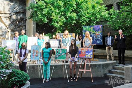
This. is. adorable.
Leave the Drama for Yo Mama
The big story of the episode is that there really was no story. Everyone decided to let yesterday’s bygones be bygones. Even Bert awoke determined not to do anything he would regret the next day.
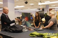
And the presence of these mature teens seemed to encourage the designers to act their age…or at least something older than 13. Even Viktor, who initially snarked at the challenge of working with children and got one of the more outspoken teen artists as his partner was on his best behavior.
It probably helped that these were teens, rather than children, who were especially mature and some were even quite talented.
Inspiration…gently tapped at the door?
The junior artists may have inspired better behavior but even they could not spark excellence in design in this group.
Laura loved her “little Dali Lama” who told her, “Failure is opportunity in disguise” but then proceeded to sketch what I suspect was a bridesmaid’s gown for Belle’s wedding to the Beast.
Olivier, heretofore having existed only in a world of beige, is struck senseless by his student’s colorful painting. He stares, confused, at his blank notebook.
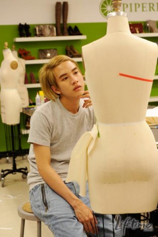
He finally grabs some cursed chiffon, presumably left behind by Danielle, and hopes that it will be avant garde. Because when I think avant garde, “chiffon” just leaps to mind…
Joshua can’t find his inspiration because his student’s painting is “organic” and Josh “likes things that are fake”. Like his eyebrows. And personality.
Josh C. bought a bunch of fur for his snarling wolf inspiration painting and then reminds himself to not be too literal. Do you know how many plush puppies had to die for that fabric? What a waste.
Bert, who of all people should know his terminology, is getting the “call home” and villain rehab treatment. I think he’s headed home and his design does not reassure me at all. His initial sketch has some interest and plays with the proportion but on the mannequin is a pair of the ugliest Tweedle Dee and Tweedle Dum pants I have ever seen.
Walk, Walk, Fashion Baby!
Kenneth Cole is a guest judge–again, a name that comes screaming to mind when one thinks “avant garde”. To bad Nina couldn’t make it this week because, as helpful as Kenneth Cole was, this was not the best use of a fashion guru of his stature.
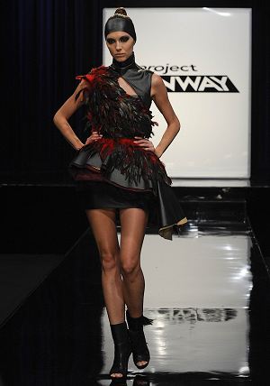
Kimberly: I am now completely on Team Kimberly. True, this is derivative. McQueen and others have done it before and done it better–but probably not on such a low budget and with a short amount of time. I can’t call it avant garde–at least not anytime in the 21st century. However, this look exudes strength and it is definitely attention-getting fashion.
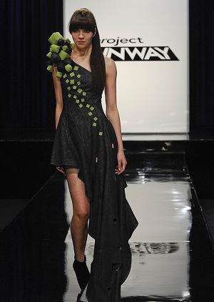
Becky: This dress is what people mean when they say “student-y”. Becky takes a semi-interesting concept and then interprets it too literally with arts and crafts execution.
Essentially, this is a denim dress with stuff glued to the shoulder and cut outs in the forward “train”. Still, I thought this was better than many of the other entries this week.
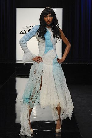
Viktor: This dress received some fan support but, frankly, I do not get it. Perhaps if it had been done in different colors instead of hygiene pad commercial blue and white. She looks like a stripper who had trouble getting her dress on straight and ended up in a shredder. There’s just no grace to it.
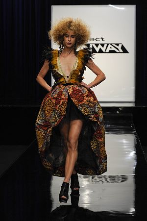
Anya: I would put Anya in the same category as Kimberly this week. Her look is definitely bold and vibrant and aggressive. She even has an interesting silhouette that plays with expectations while still retaining a certain beauty. Like Kimberly, this has all been done before…but at least it is an interesting art look.
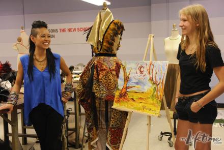
And it is tied to the painting both in color and in shape without being too literal.
I hope that, at this point, we can lay to rest the speculation about Anya’s sew skills. She seems to have a decent skill set and is able to work within her limitations.
Yes, she is manipulative and charming and gets by on style…but she really is not out of place in this competition, especially given that even more experienced designers need to take sewing shortcuts with the time limitations.
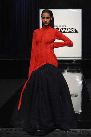
Bryce: Bryce looks at the haunted portrait his artist painted and immediately thinks “straight jacket”. This is not bad but could have been so much more. He should have played more with the idea of fashion and roles constricting women. It has a certain chic quality but is rather understated.
The Vanguard
The kids who were deemed most avant garde of the bunch were:
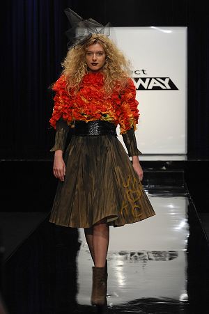
Joshua: This is not a terrible look but I would not have judged it to be in the top three. The color story is the same one that Fallene got ridiculed during the pet store challenge but it did not bother me then, either. What I like most is that Joshua found a way to make the organic synthetic and simulated with the painted neoprene. So he did a fine job of drawing up the painting and making it his own. But avant garde this is not.
Heidi likes the painting and Kenneth Cole likes the way the skirt drapes. Michael Kors likes the texture but says the Tim Burton-y styling is a “crutch”. But really? How else would you style this to make a case it is avant garde? This look is so very ready to wear that you need to bring a little cray-cray to the styling. Joshua talked a good game but he is just not a cerebral designer.
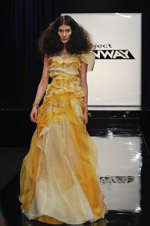
Laura: Laura’s is just… I can’t work up a lather about it either way. It’s just okay. The concept is okay. The execution is okay. That it is not avant garde goes without saying, I think. The color scheme screams Belle from Beauty and the Beast. The asymmetrical ruffles are just so done. It is Marchesa meets Christian Siriano meets a paper shredder. Some have suggested that it is reminiscent of Leanne but I think that part of what made Leanne’s perspective so interesting was how structural her “ruffles” were…they were barely even ruffles because of the architectural quality.
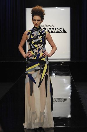
Anthony Ryan: The minute this walked down the runway, I knew it was the winner. I can’t shake the feeling that I’ve seen this dress before but, assuming I am wrong, it is an innovative take on a dress.
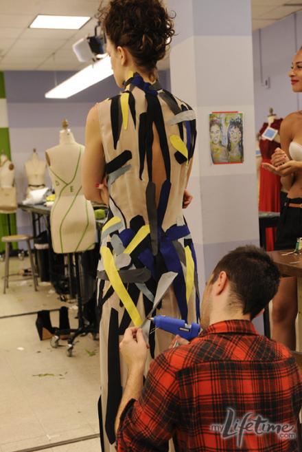
The execution is horrendous, of course. He basically just hot glued on rough strips of fabric.
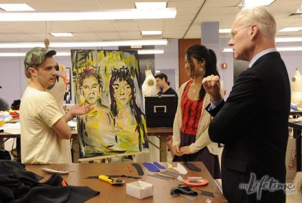
And the connection to the inspiration painting is just a tiny thread of the formal element of the thick brush strokes and the color.
The idea was the most conceptual, though, and the placement of the brush strokes was artful. I think it might have been more interesting if the netting was less obvious. Also, I would have been interested in seeing the brush strokes continuing up over her face to challenge our assumptions about the purpose of clothing.
Left Behind
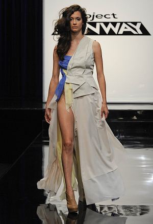
Olivier: This is just depressing. And not in the intentional, emo way. This just may not be Olivier’s show. He just seems incapable of breaking out of his aesthetic at all. Even the styling is just a complete surrender to dreariness. I think Olivier should have gone for a highly-structured piece in a canvas-colored material (like he did partially) and then just dyed the very edges of the fabric with the colors of the painting. Or, really, anything else beyond what he did. Because this is terrible.
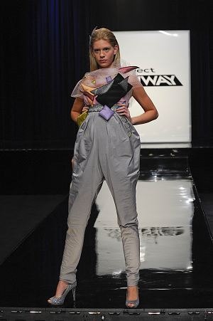
Bert: Bert’s design was at least interesting. However, it was just ugly. Not aggressively ugly or interestingly ugly. Just ugly. Passive aggressively ugly? His original sketch had a much more elegant silhouette.
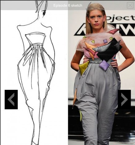
If he had pulled that off, he might have been the winner, just by virtue of having a look that would have been avant garde at some point in semi-recent fashion history. As it is, his model looks like Humpty Dumpty after he fell into a preschool toy bin.
Heidi says she would look like she was pregnant with baby number five and Michael replies that she would look like she is baby number five.
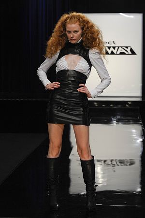
Josh C.: This is what the vampires in True Blood wear to Fangtasia to fulfill the expectations of the mortal tourists. This is a college co-ed’s last-minute Halloween costume. And the styling just emphasized the short-comings. This is not only not avant garde, it isn’t fashion. When Josh C. mentioned the rib cage and the idea of being caged, I had high hopes for horizontal boning revealing a vulnerable and soft inner core. There was a germ of an idea…but ultimately I think Josh C. was just out of his league.
First and Last
As I expected, Anthony Ryan wins. He is filled with glee to be a “Bride” and “not a bridesmaid” after so many times in the top three with no wins.
Joshua stares daggers at him. How long until his ego explodes in a gooey mess?
Bert is in because Heidi still loves him and because they can’t kick out the one guy who knew what avant garde means.
Olivier is in because his droopy mess at least made the judges feel something–even if it was mild depression.
Josh C. lacks the self-awareness and pretension…not to mention the skills…to compete. Bye, Josh C., the Mr. Clean Mormon.
