I already looked at the top and bottom three Project Runway designers from this week’s “unconventional materials” challenge at Dylan’s Candy Bar. Here’s a quick rundown of the rest of the not-so-sweet entries (although a few of these are quite good):
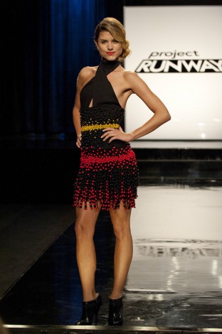
There is some discussion online that Dmitry, the emo Bond villain, should have made the top three and perhaps even won the whole thing. There is no doubt that his model looks great in this little Samba number…perhaps Dmitry’s ballroom dance experience shows more than he might like?
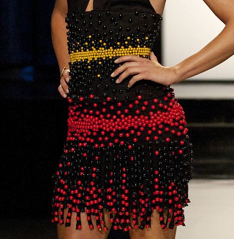
The way he distributed the candy gives the dress an effervescent quality. It was well-made and, of all the dresses, moved well on the runway.
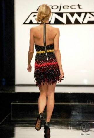
And, plus, it is hawt. Amazing that Dmitri can produce something that exuberant, isn’t it? Frankly, Dmitri may have been the most surprised of all…”Keeds? and candy” ugh. This is…not for me.” As I hypothesized in the winner/loser post, however, if the more traditional designers are game, I think they are most likely to ace the unconventional materials challenge. They focus on transforming the odd materials, which gives their designs added interest. I’m guessing that his use of the t-shirt fabric up top kept him out of the top three. If he had only used black licorice to create a leather-like treatment for the top, I think he would have been a challenger for Ven.
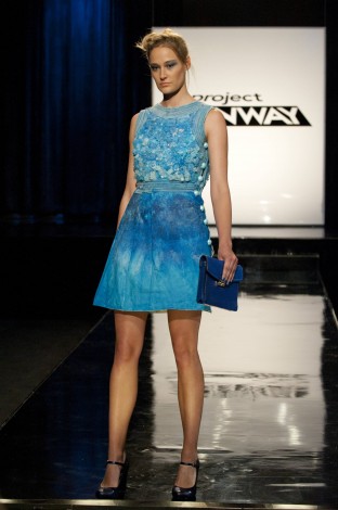
While Fabio may have fallen short of “Modern Jackie-O”, this is a cute little dress and a clever use of materials. I suspect that Ven’s more dramatic use of rock candy is what kept Fabio out of the top three. The sour strip trim defines the shape nicely and the gumball “buttons” are a clever touch. The ombre effect is lovely…though I had flashbacks to Season 9’s repetitive vocabulary lessons. I think this was achieved with rock candy sprayed with water.
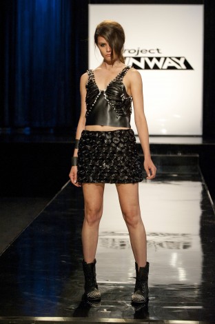
Melissa had another strong entry this week, though she will definitely need to work some color in. If she looks around a candy shop and can only see black licorice, this does not bode well for the future.
Still, the leather-work she did with the silver beads up top was definitely strong.
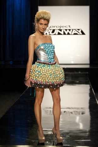
I thought this was a striking little number and had a nice little wink to the candy-store theme, while still looking like something at an over-the-top runway show. I think the literal heaviness of skirt is what kept Nathan out of the top. Otherwise, the metallics and pastels make for a fun pattern on this Hershey’s kiss of a dress.
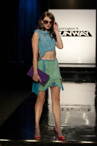
There was something a bit odd about the hemline but I thought the use of the candy strips was strong. Plus, the rosettes at the neckline definitely looked like an on-trend technique to me. A good middle-of-the-road entry from Raul.
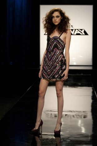
I’ve seen a few people argue for Christopher’s entry but I think it looks heavy and sloppy, personally. I do not like the chevron’s not matching up, though I suppose it was intentional. Not offensive enough to be at the bottom at this point of the game but definitely not a winner for me.
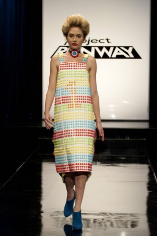
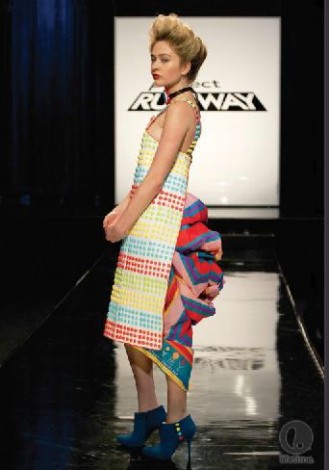
I have mixed feelings about Andrea’s dress and her work in general. I get that playing with silhouettes and shape is her thing. While that might not be my personal taste, I think it can be done successfully from a design perspective. However, my concern with Andrea is not just that she alters, or even obliterates, the female shape but rather that she seems to ignore it entirely. Her models almost seem to become walking easels for her brand of modern art. However, this may be just a fit issue, complicated by the lack of time.
In this case, I would have liked to have seen her break of the dots to create the illusion of shape and/or movement in the front of the dress. The bustle is interesting enough but it seems too out of place as a design element (although I can see what she was going for with the whole “Victorian Candy Shop” concept) and it is just fabric. Overall, not enough transformation happened here.
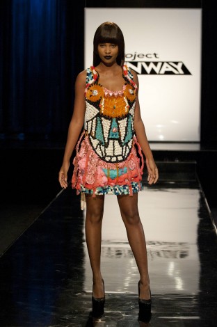
When you let a guy like Kooan, everyone’s favorite anime Project Runway contest, free in a candy store, this is what you get. This is why the more wacky types really struggle with a challenge like this. They get overwhelmed with the options available. We’ll really see what Kooan can do when he is given more structure and has to see if he can maintain his perspective within the constraints of the challenge. This is a hyperactive sugar-high in dress form and, even worse, it looks like a craft project. I like the braiding/weaving he was originally doing with the orange licorice whips. It is too bad he could not pull off an entire bodice or even a bodice of that.
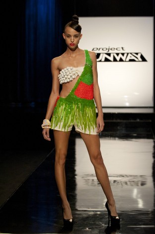
Alicia’s entry was one of the worse to me. The poor model looks like Pebbles has gotten a bit desperate after she developed a skin disease on her chest and Bam Bam left her.
